Urgent Care Scheduling Widget
for Providence Health
Overview
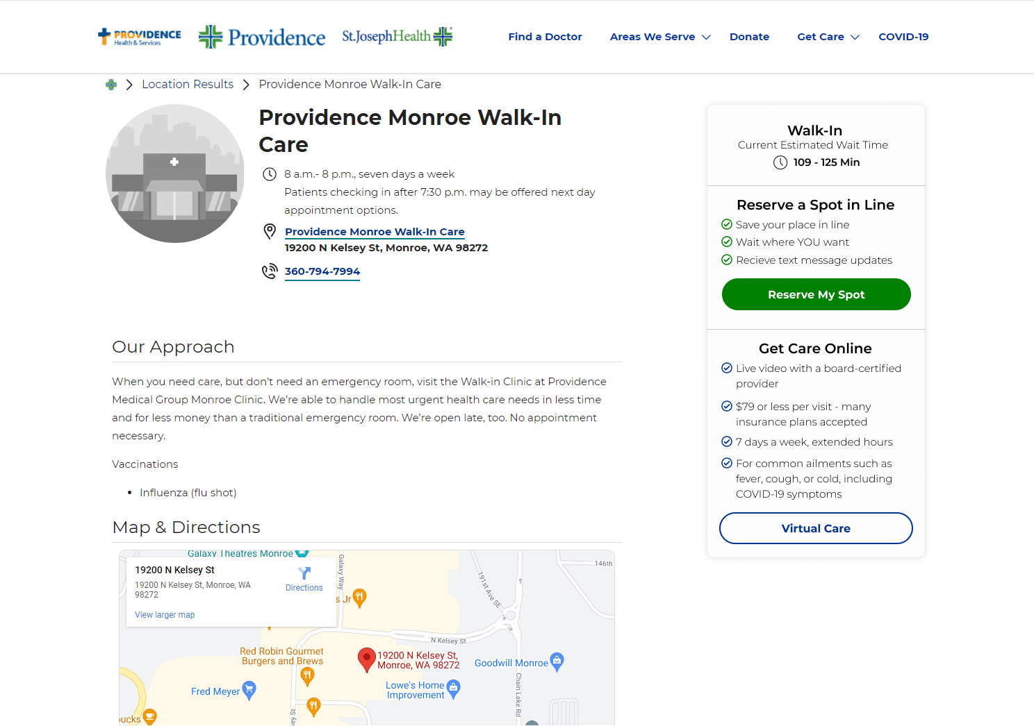
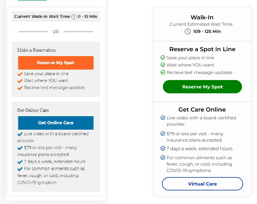
The object was to redesign an existing widget that is used for scheduling urgent care appointments at Providence Health urgent care locations. The new widget needed to better align with Providence’s site styles. After the redesign was complete, I needed to provide various iterations for A/B testing, which would ultimately inform the evolution and final design of the widget.
Purpose of Widget
To help users select 1 of 3 choices for scheduling an urgent care visit:
- Just walk-in and wait (based on the displayed wait time)
- Reserve a spot in advance (so you don’t have to wait)
- Do it virtually (no need to come to clinic at all)
Design Requirements
- Change buttons so they align with site design (colors, size, rounded corners)
- Improve check list styling
- Reformat the entire widget to use less space
- Make sure mobile experience is optimized
- Consider placement – likely stacked on the upper-right will work best
- Consider changes to the titles/ button text that make each option more clear
My Role
UI designer
Initial Redesign
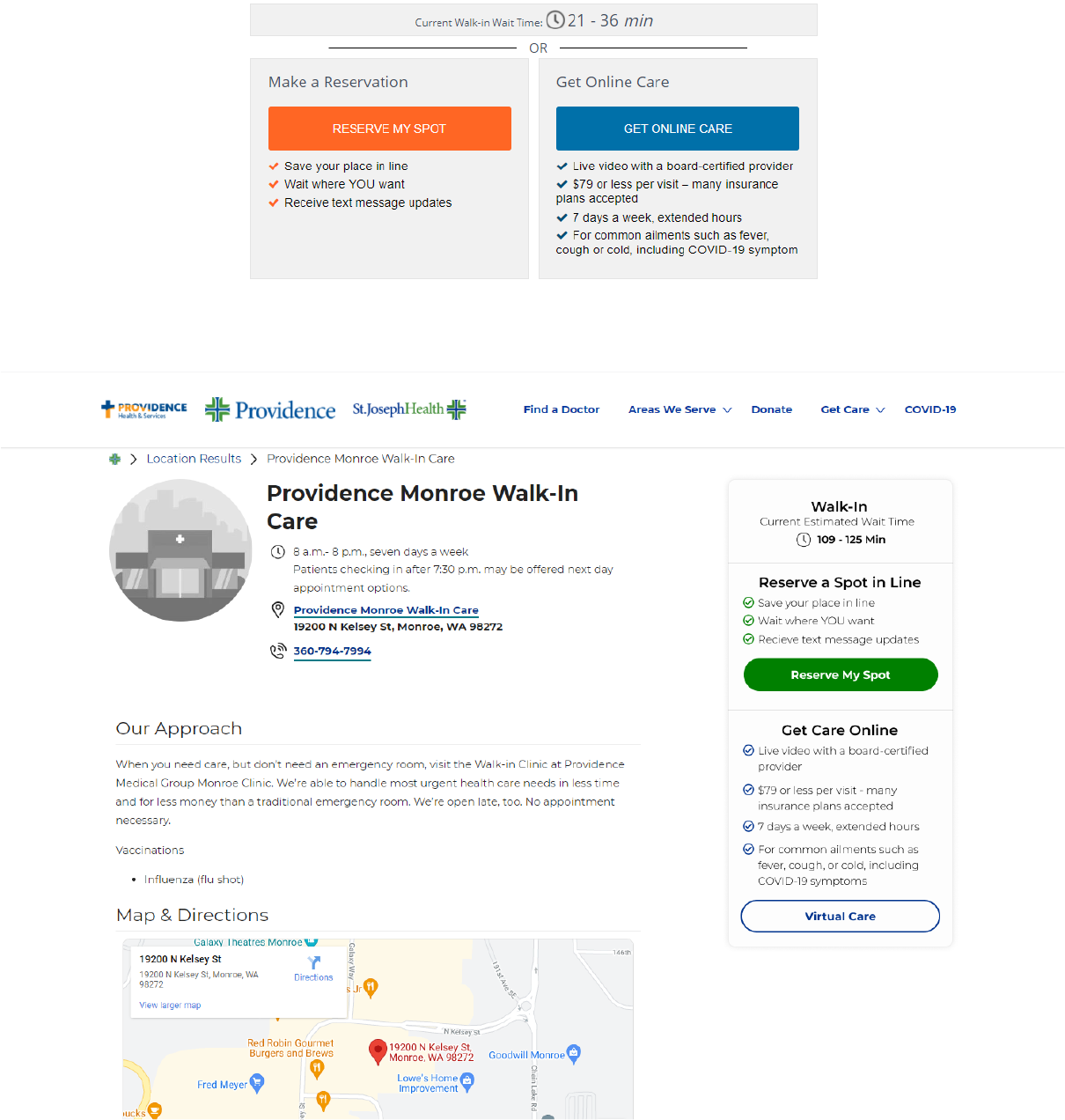
I grouped all three options into one larger, uniform box. On mobile, the widget spans the full width of device. In desktop, the widget is an aside on the right and is fixed so that it is sticky while the user scrolls.
I separated the three options more clearly, using:
- Borders
- Heavier and larger font-weight for headings that stand out from standard copy
- Separate colors for the different options
Evolution and Testing
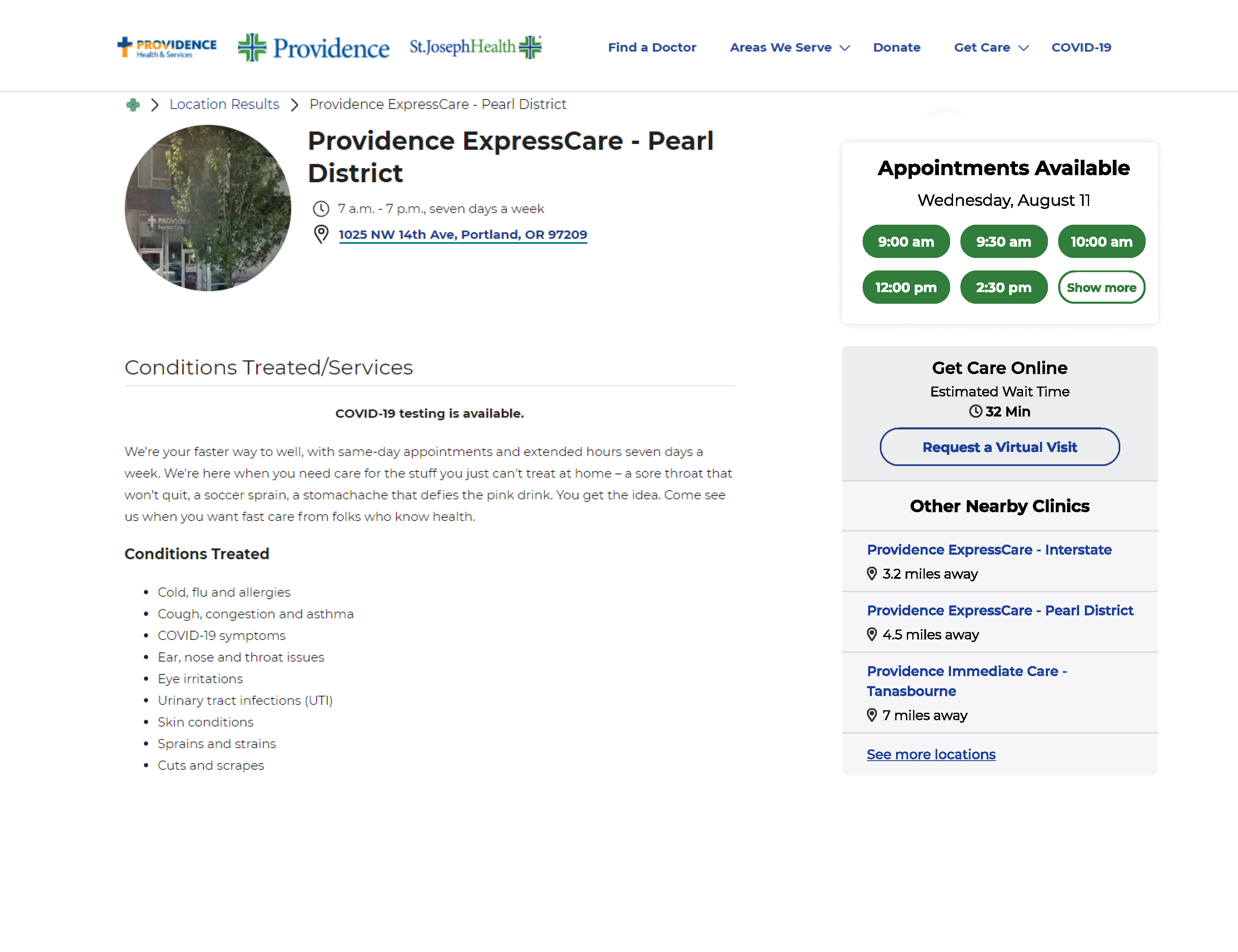
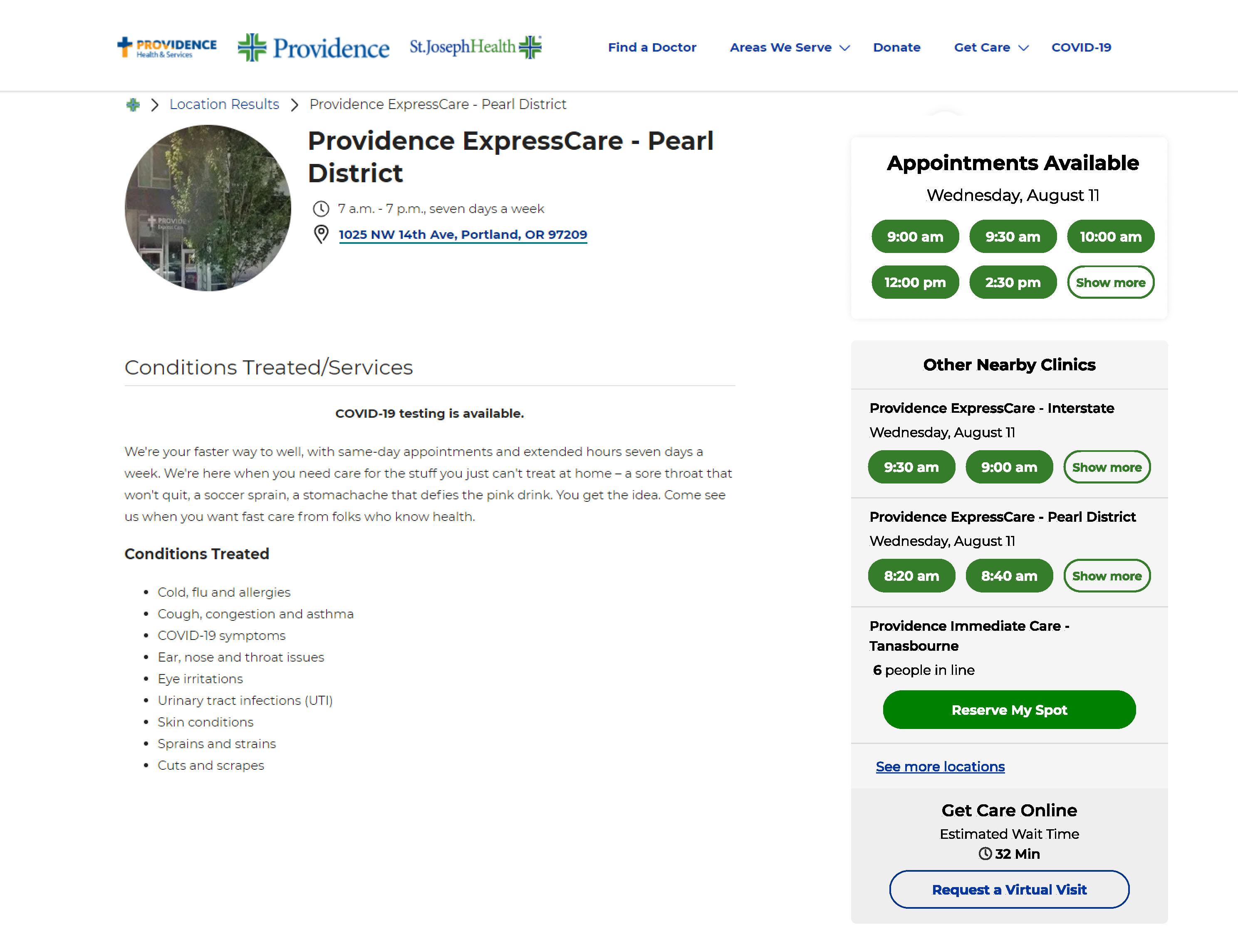
Alongside the original three scheduling options, we added a fourth, which would provide users with nearby clinic options if the current clinic’s scheduling options did not fit their needs or schedule.
We tested two variants:
- Hyperlinks to nearby clinics with the distance from current clinic listed, along with a link to a directory where users could see more options
- Added schedulable timeslots or a link to an intake form (depending on the different clinic’s ability) to variant #1
We were testing which variant would increase digitally scheduled appointments the most: Schedulable timeslots for nearby clinics vs. linking off to the location is sufficient with no timeslots (by doing the latter, noise in the widget would be cut down).
Testing Outcome
Variant #1 won out, showing that providing users with schedulable timeslots for nearby clinics does not add value.
- Variant #1: 12.7% increase in digitally scheduled appointments
- Variant #2: 6.6% increase in digitally scheduled appointments
Project Outcome
By redesigning, then iterating on the widget, we were able to provide users with an easier scheduling experience, leading to an increase in digitally scheduled appointments.