Brisson Piano Service Website

View Brisson Piano Service website
Overview
After working for reputable piano tuning businesses in New Orleans, David Brisson decided to start his own. After relocating to Northern California, he began to hash out his dream.
While David knew the business side of things, he needed direction as far as branding was concerned. This is where I stepped in.
My Role
David hired me to design and develop multiple facets of his brand and presence, including the:
- Logo
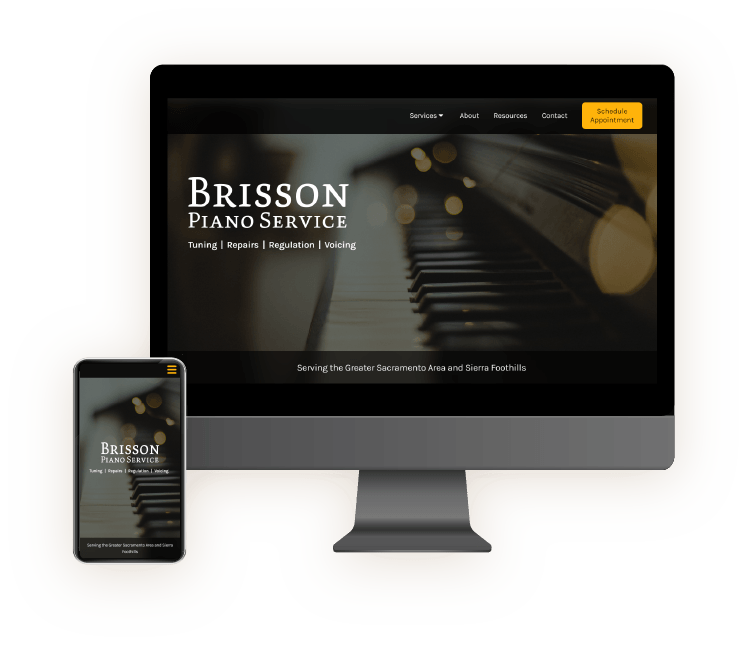
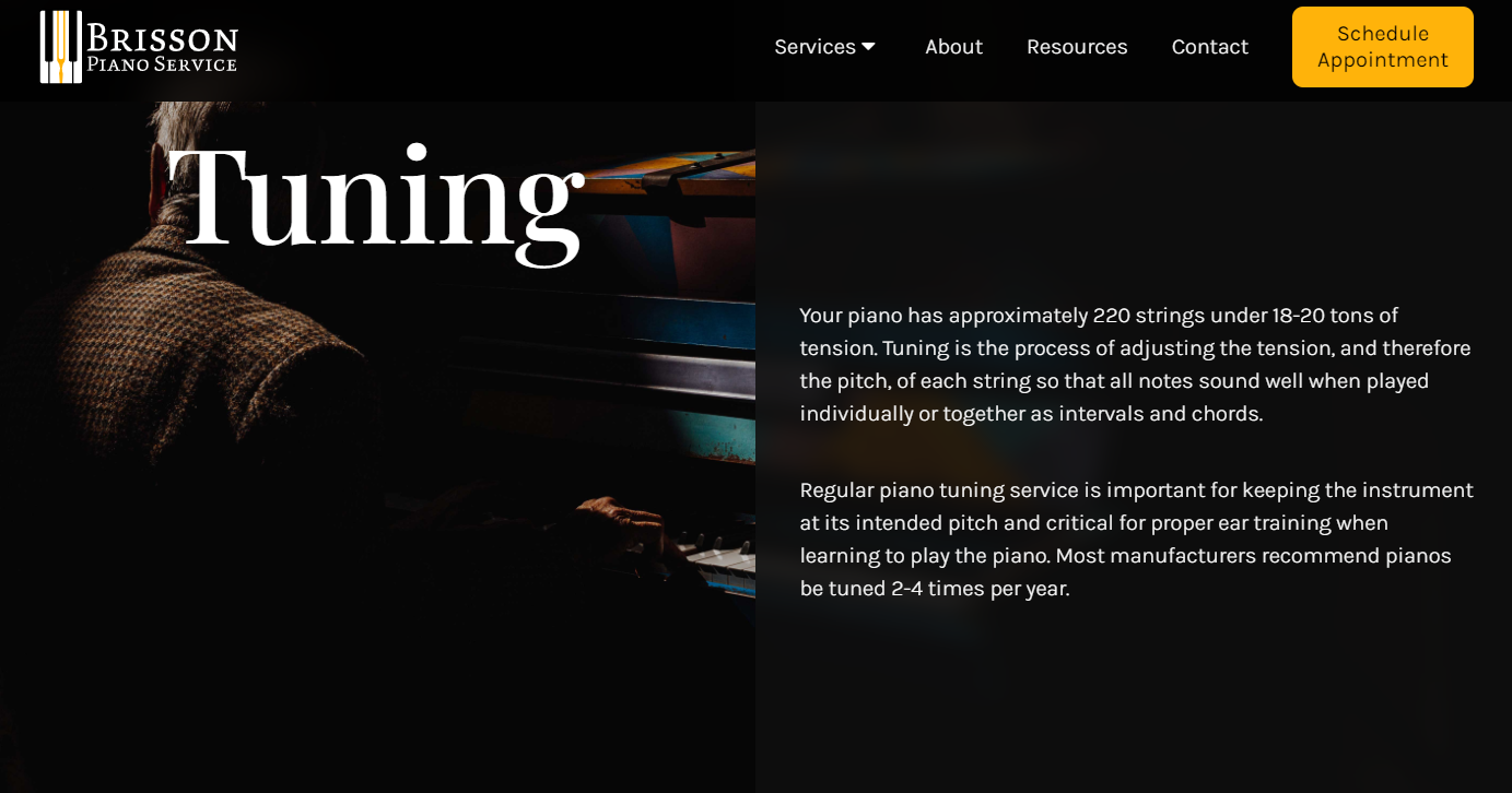
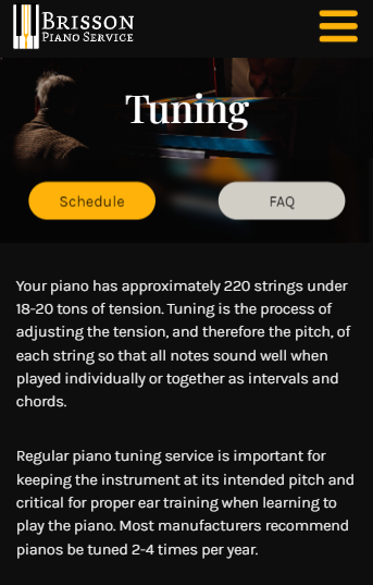
- Website
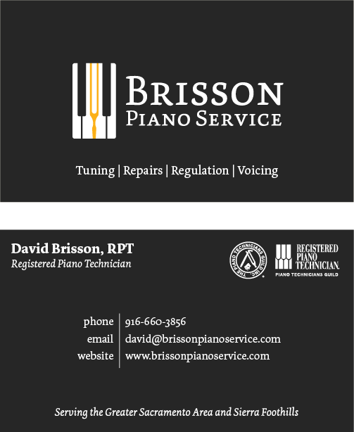
- Business cards
- Brand colors, typography, and overall style/feel
- An important aspect of this site was to empower customers by giving them a wide berth of educational material regarding their piano and its upkeep. It was important to organize this information so that it could be easily accessed and digested.
- Creating a logo that stands apart from other piano companies and tuners while still utilizing the mainstays (tuning fork and piano keys).
- Building a brand from the ground up and setting it apart from the competition. Since he was new to the area and did not have the client base or word of mouth reputation that existing tuners had, we had to make sure that the website made Brisson Piano Service stand out from the rest.
Challenges
- Along with a dedicated resources page for information regarding buying and caring for a piano, each service page has a “frequently asked questions” section to aid in more specific matters (such as tuning, voicing, regulation, etc.).
- The logo is a simple and symmetrical design consisting of piano keys with a gold tuning fork in the middle. The integration of keys and a tuner is one I had not seen. The simple design allows it to be used across a variety of mediums.
- David’s website has much more in the way of education when compared to other sites. We wanted to give more information and power to the customer, so David and his wife spent a lot of time curating content that would help educate the users. I incorporated all of this into the site, along with additional resources, services, and pricing, making for a more robust website when compared to others in the industry.
Solutions


Process
David was just starting his business as I came on board, which meant the sooner I wrapped things up, the sooner he could begin to gain potential clients. Because of this, I was working on many sides of this project at the same time.
When we spoke about how the brand should be perceived, it was agreed that it should feel elegant and professional. The logo was the first item created so he could have something for his invoices. Soon afterwards, I designed the business cards.
Throughout this, I was also working on a content audit to see how best to structure the IA and pages. Since there was a significant amount of educational information alongside the standard service lists, good organization was key.
Once finalized, I began working on low, then high fidelity mockups, and once approved, I began the website development. The launch happening soon after.
